
Optimi Health App
📅 2021
✏️ User research, UX design, insights analysis, UI design
👥 3 UX and product designers
Case and Brief
Optimi is a new-born app for knee rehab and physiotherapy with a personalised exercise program powered by AI and machine learning.
The app aims to provide everything you need to manage your physical health – personalised exercise plans, supportive communities, access to the latest research and world class clinicians and exercise professionals.
Optimi wants to increase their users’ engagement with the exercise plan, focusing in particular on the onboarding quiz and retaining users at workout stage.
The challenge
To provide a measurable and flexible workout plan, so that users can track their performance.
To pair the exercise plan with the scientific basis behind it, so that users understand and gain trust in their plan.
To connect the users in an interactive community, so that users feel the support they need in their rehab.
The final output of the project is a prototype for a renewed app that:
. provides a scientifically sound workout plan that can be adjusted to the user’s needs and progress;
. keeps track of the user’s recovery, tracing the daily exercise activity and the mood of the recovering patient;
. gives access to a relatable community of knee-injured people, to allow users to create bonds in their recovery journey.
Research and insights
A competitors research was carried out first. I compared Optimi with some apps used in the medical and physiotherapy sector, and then moved on with the team to analyzing the less medically focused panorama of fitness and sports apps.
As Optimi is already a live app, I audited the current user journey. The reassurance of the app being scientifically sound is consistently offered to the user throughout the onboarding and workout plan, however there are a few points that could do with improvements:
The onboarding quiz, assessing the health and fitness of the user, is very long, without any indication of its duration; the stakeholder interview revealed this is the biggest drop-out point of the user journey.
The workout plan is made of few mini-videos based on the answers given during the onboarding quiz: despite the good explanation on how an exercise should or should not be performed, there is no follow-along. Additionally, the workout seems to consist in mundane repetitions of basic physiotherapy exercises, and once a set of exercises is assigned to the user, there is no way to level up or down the difficulty of it.

The team then selected 8 participants, 25-50yo, active and interested in exercising, with knee injury to carry out user research sessions. I contributed in each interview either leading the conversation or taking notes. We quizzed participants about their injury, their health and sport goals and their relationship with tech and apps, roughly following a discussion guide that we prepared beforehand.
Thanks to their answers, we condensed the user research in an affinity map from which few themes emerged. I then traced 3 personas with my teammates, to summarize Optimi’s audience. (How did it go? I tell a bit more of the story in My Takeaways.)


I was then able to note some user stories and identify 3 problem statements.

“
As a sport enthusiast, I, Jake would like to have personalised guidance, so that I know how far to push myself each time without risking hurting myself.
- Jake
Optimi needs a way to measure and track the users’ performance, because they want to see their progress.

“
As an explorer of the fitness world, I, Michelle, would like to interact with relatable people in the same situation as me, so that it will keep me motivated to exercise.
- Michelle
Optimi needs a way to tie in the scientific info and the exercise program, because understanding why an exercise is beneficial keeps users motivated.

“
As an active but cautious middle-aged user, I, Andrea, would like to have access to easy-to-understand information, so that I can trust I can exercise without risking injuries.
- Andrea
Optimi needs a way to connect users, because a community of people going through the same rehab plan is the support users need.
Solution
Thanks to the thorough research we conducted, we could base the redesign of the app on few major elements:
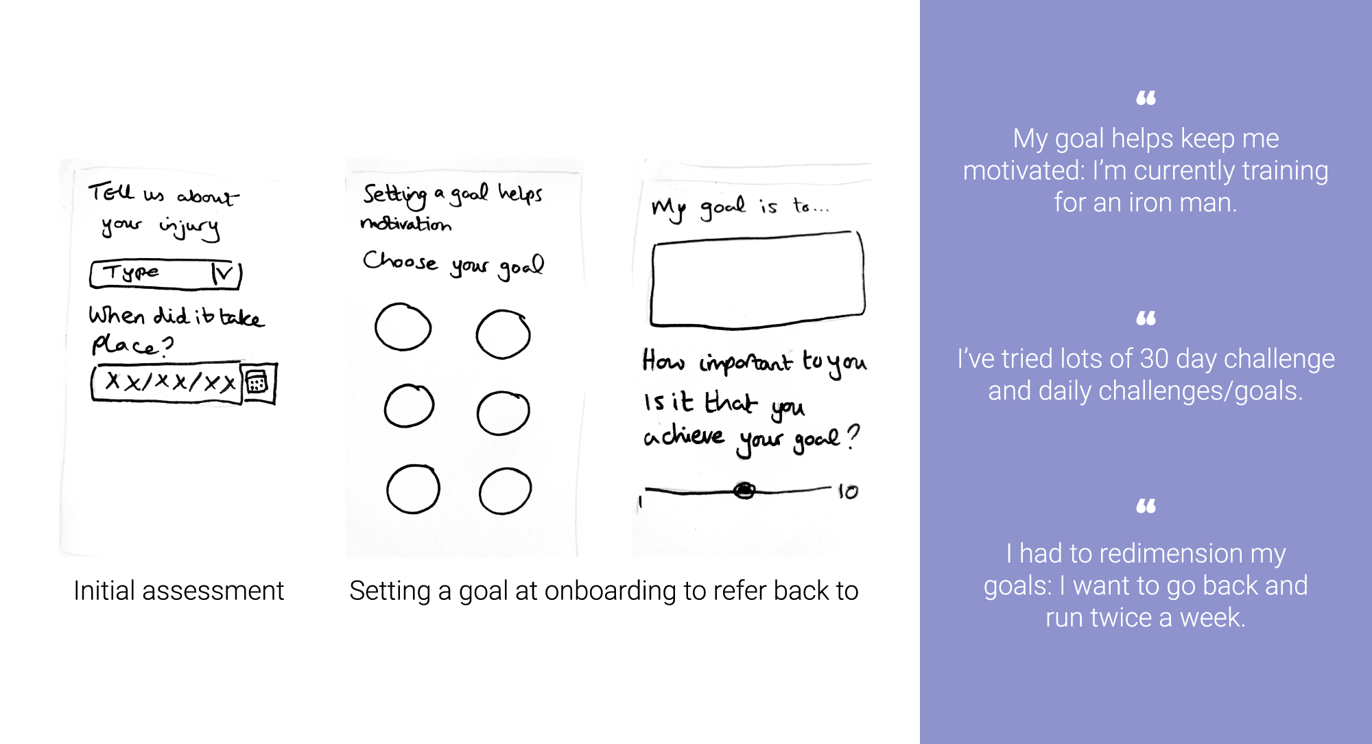
The plan must be goal-oriented, keeping into consideration that each user has a different fitness status and sport goal.
The science behind the plan must be tied into the plan itself, providing legitimate guidance.
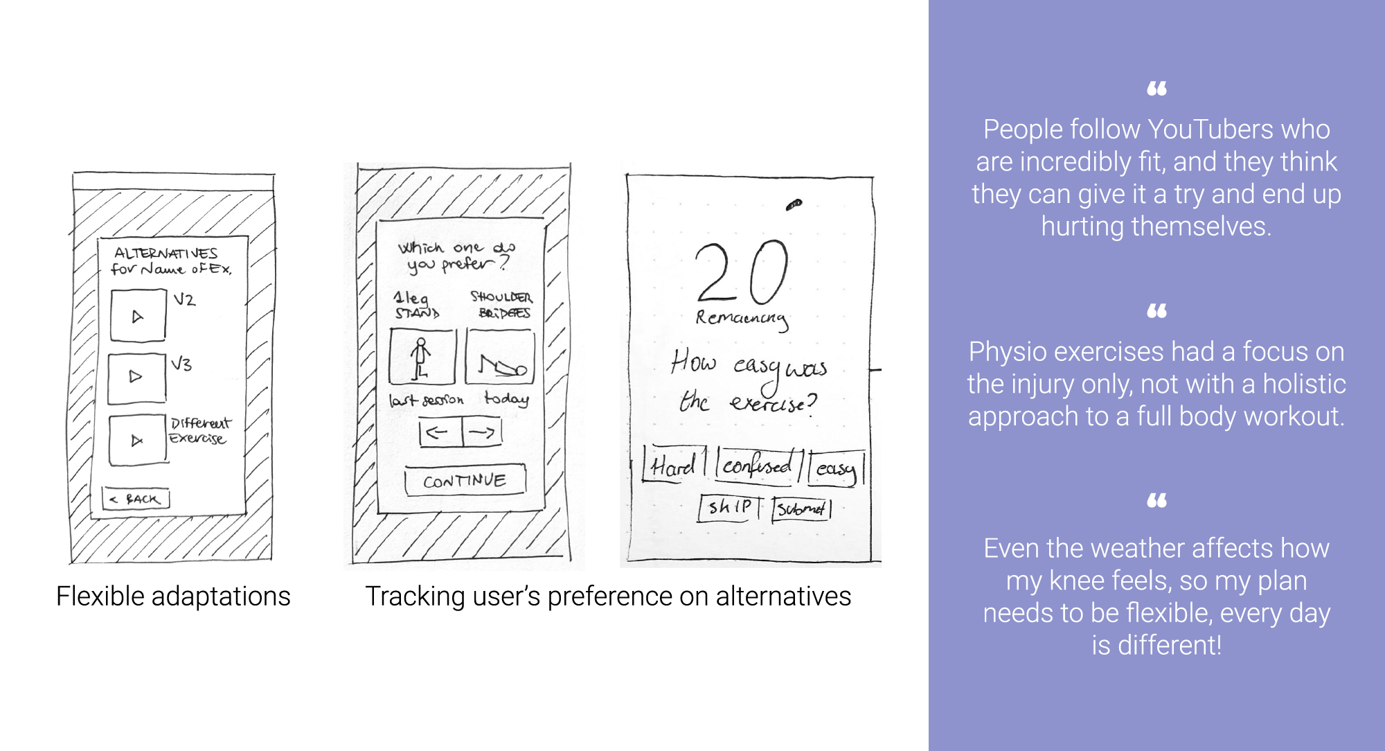
The plan must be flexible, so that the user can adapt the exercises to their own needs.
Like any patient’s recovery, the plan should have a more holistic approach, keeping in mind the user’s motivation.
In compliance with its flexibility, the plan must provide ways to track both the user’s performance and the rehab of their injury.
Goal oriented

Legitimate guidance
Tailored, flexible plan

Holistic approach

Trackable progress

Community
We conducted the usability tests on the low-fidelity prototype, testing only 3 of the main flows (onboarding, setting a goal, navigating an exercise session), with the objective to understand how the options on the screens are perceived by the users and whether they are able to complete the tasks. With just a few tests we were able to adjust and tweak some details.

Goal oriented - Feedback from usability tests.

Legitimate guidance - Feedback from usability tests.

Tracking progress - Feedback from usability tests.

Tailored, flexible plan - Feedback from usability tests.

Holistic approach - Feedback from usability tests.

Community - Feedback from usability tests.
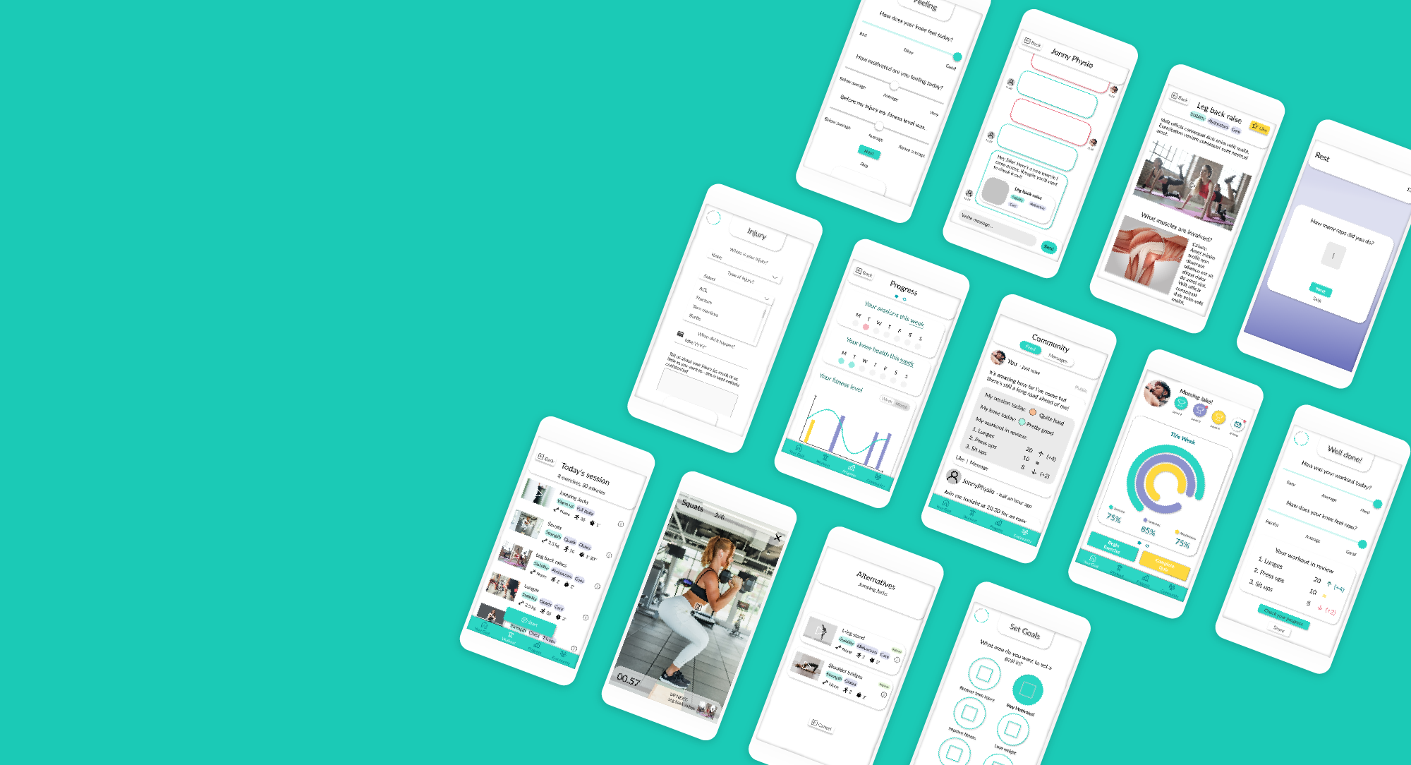
High fidelity prototype
The onboarding quiz is structured in 3 separate sections: injury, goals and feeling.
The user can click off and complete the quiz at another time.
This questionnaire affects the selection of exercises included in the user’s workout.


The workout session overview is built of cards for each exercise, including labels to detail them. We’ve already taken onboard some feedback from the user tests, including indication of equipment alongside the functional aspects and the sets&reps of each exercise.
The full screen video ensures an immersive experience. The video instructions last as long as the exercise should last for the user, who keeps the pace thanks to a timer: all these elements should minimise the users' drop-off.
Users can tailor the program, changing exercise during the workout session. Ideally, the alternatives not only offer a full substitution of an exercise, but also up/downgrades for the same exercise, for example loading more/less weight or using props.
After each exercise, during rest time, the user can fill in his exercise performance: this will be used to measure progress in comparison with other performances of the same exercise throughout time.

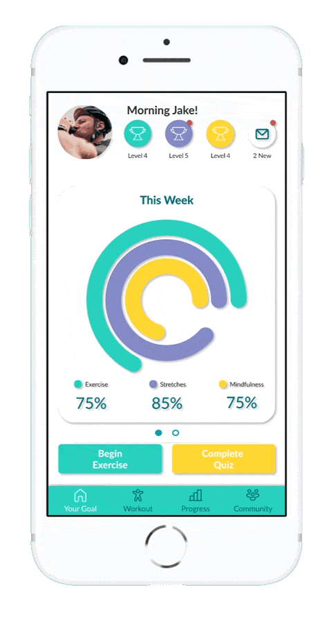

The home screen gives an overview of both the main goal and the weekly/monthly achievements. Structured ike a dashboard, it also gives access to an in-app messenger to encourage community building.
Scientific info is tied in with the benefits of each exercise. Detailed animations of how the muscles and ligaments work, allow the users to get to know their body & injury in a simple and quick way.
Building community: users can build their in-app personal profile tracking their rehab journey.
Users can share a summary of their workout sessions, and thoughts and images like on social media.

We also prototyped an in-app instant messaging system.
Whether a user needs a rehab buddy or guidance from a professional, anybody else is just a message away, keeping the conversation relevant to their recovery.

Next steps
As this was a students’ projects, the company has given their feedback and are looking into taking onboard some of the ideas we presented, to integrate them into their development roadmap. However, this is the UI design iterations I would ideally put in place:
consolidate the homescreen with the user’s social profile
iterate on the alternative exercises (e.g. stretches and mindfulness) as conceptualised in the low-fi prototype
include users’ data inputs (at onboarding, during workout, etc) in the app’s AI and ML
experiment with graphs and stats
…and further testing
My takeaways
Although I was already familiar with design thinking, my past experiences haven’t allowed me to apply it all from end to end, on a digital product.
When we started drafting personas, because of what the company founder disclosed about their subscribers, the team included one that wasn’t really based on anyone we have interviewed thus far: we knew it was definitely a potential user group, but that persona was made up of a collection of assumptions. I then insisted we interview a couple more users that, based on their injury and demographics, could fall into that user group. Thanks to few more interviews, I adjusted the third persona to become Andrea, the cautious but active user. The previous persona shared their goals with Jake (the sport enthusiast), and their behaviours and frustrations looked like the ones of Michelle (the fitness explorer) but senior; the additional interviews revealed Andrea as an entirely different character, with a distinctive need for a holistically solid recovery and a scientifically sound rehab plan.
Overall, I feel this project convinced me (if there was need!) I would like to focus on user research, fine-tuning my skills to detect patterns and affinity in human behaviour.