
TOWER London website audit
📅 2019-21 / 2021-23
✏️ UX audit, web UI wireframes and mockups
👥 1 Marketing and CRM Executive, 1 Experience consultant
Case and Brief
Tower London is an independent footwear retailer,
quintessentially from London, trading all over Europe and beyond. Following the brand’s growth and anticipating an important anniversary the following year, in 2019 the company redesigned their website interface and started the transition to a new e-commerce platform.
I was assigned to carry out a general UX audit of the website, particularly focusing on the mobile experience, and to mockup few screens as guideline for redesign
(an external agency was appointed for it). Once transitioned to the new website, I am routinely tasked to mockup features on the new interface, to brief the developers and guide them in the implementation and further tweaking of the UI.
The challenge
Prioritise contents and CTAs to ensure a smooth browsing and uninterrupted funnel for the users.
Provide a visual brief to the appointed web designer and developers, proposing possible solutions that fit in Tower’s brand system and they could use as guidelines.
Research and insights
Following Google’s guidelines and best practices for mobile UX in retail, I carried out a general UX and UI analysis of the company’s 5 years old website. Almost 3/4 of Tower’s customers browse the website from mobile: the original website wasn’t optimised for mobile use, pushing important content below the fold and offering inefficient or misleading calls to action to the users.
With the help of an external Experience consultant, a user tracking system has been set to follow the customers from click to click in their journey to the purchase. After name, price and photo of a product, the most important piece of information for a customer are delivery and payment options.

Homepage
As the old website UI used lots of estate for logo, navigation and USP, there wasn't room for an effective link to the main categories. Although the first mockup included the main shopping categories and consolidated the logo and main navigations in a single container, it went through a heavy redesign.

Main navigation
Whilst the old website delivered a quick navigation to the main shopping categories, the main menu actually needed to include after sale options and CTAs, including a store locator and a customer service contact.

Search function
The website updgrade has been the chance to embed third parties' tools, such as a search tool with the ability to retain recent searches and suggest smart recommendations.

Category and Product page
With the main objective to push product name, price, reviews and photo all above the page fold, the redesign of the product page was a pivotal part of the whole website upgrade, and is analysed in depth in the next section of this case study.
Conversion funnel
The checkout page was extremely confusing and at times misleading. From the very first mockup, the checkout has been consolidated in one single pagination, with sections appearing one by one. An effective order summary, showing all relevant data to give confidence for the user to convert, is immediately visible at the top of the page.
Solution
The redesign mainly focused on:
a consolidated, single line header throughout the website;
an easy to navigate menu and search function, therefore re-thinking of the content hierarchy in the dropdowns;
the most important pages from a retail business perspective, such as the checkout page and the product page.
Some of the small tweaks, or in those cases where the team debates whether or not to implement a feature, these were first A/B tested for 2-4 weeks thanks to a Growth Management & Personalisation Platform. I constantly collaborated with their team and I briefed them around these UX tests.
What follows are some of the mockups I made to provide developers and A/B testing partners with a UI Design brief for them to implement.
product page
Social proofing
category page
Quick view popup
home / main landing
Banners style guide
product page
Product options
product page
Full UI rework
Product Page - PDP
Full UI redesign
The progressive redesign of the product page is broken down as follows, into the images and captions. All elements on the page changed position and dimension to deliver a better visual hierarchy and easier navigation on the page.

1. Product Description Page - The most important page on which customers land, the PDP has been heavily analysised and redesigned, restructuring the visual hierarchy and making sure all important info was above the fold.

2. Header - Throughout the evolution of the mockups and the final implementation, the header consolidated Tower's logo and menus in one single, recognisable block that floats when scrolling the page.

3. USP bar - Tower's main USPs needed to remain prominent but take less space above the fold to allow more shopping-relevant info for the customers. It's now the top line of each page but compresses into a line of branding when scrolling.

4. Product photo - The whole look of the product page became more premium, thanks to a slight grey background; different product angles have been carefully selected by me in partnership with the in-house photographer.

5. Product name - This has been pushed way above the page fold, sizing it so that it would take less space but look more prominent.
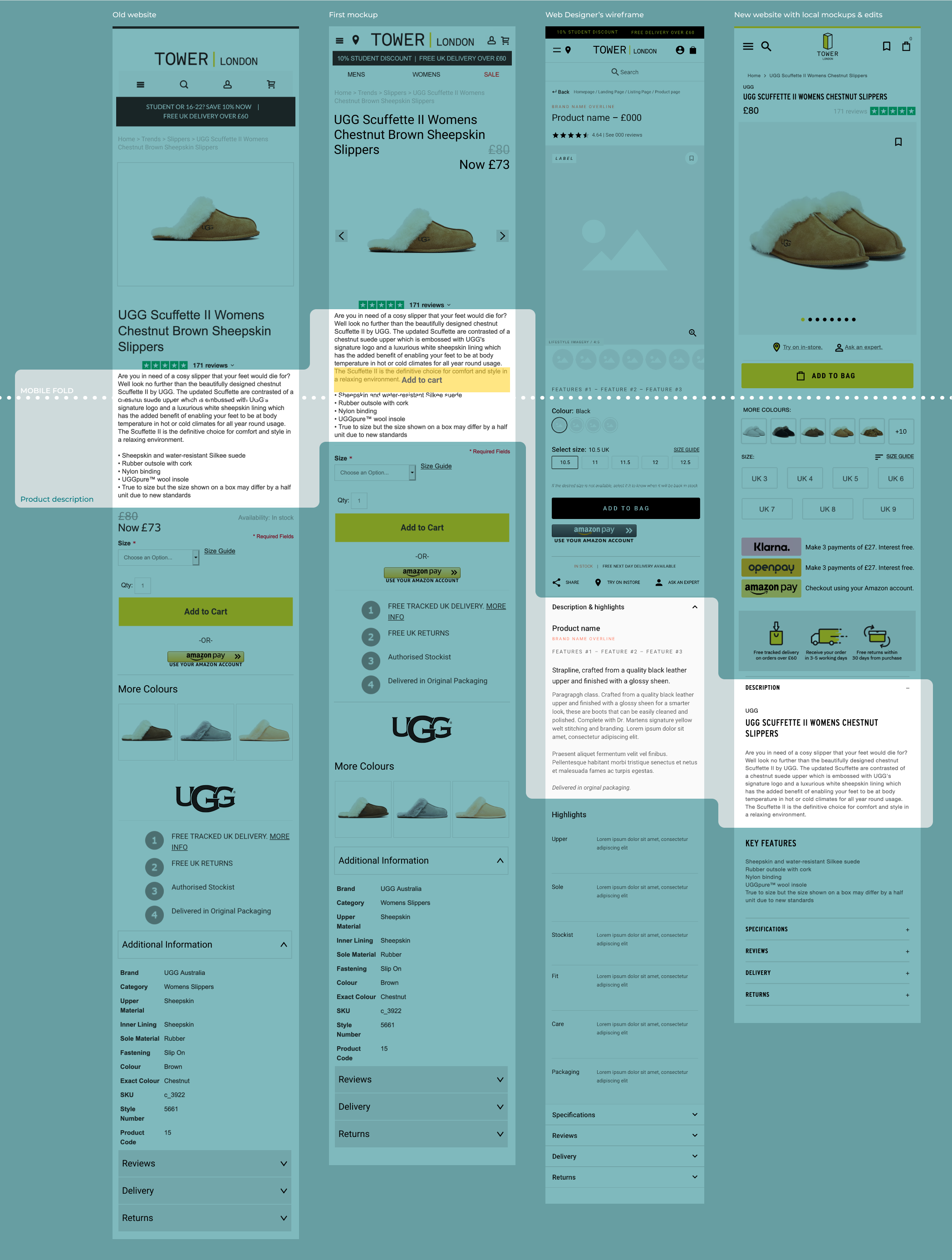
6. Product description - Thanks to a careful competitors research and click tracking on Tower's existing product pages, the team realised that the description could be pushed below the fold to leave room to more relevant info.

7. Product price - Major mistake on the previous UI, the price featured below the fold. With the redesign it was promptly pushed in the top cluster of relevant information for the customers.

8. Primary CTA - Another key point for effective marketing is a visible call-to-action: this has not only been pushed above the fold, but also made floating at the bottom of the screen when scrolling the page.

9. Secondary CTA - In the context of the website refurbishment and company growth, alternative methods of payment have been added in partnerships with third parties. This made possible to group them below the fold.

10. Product alternatives - While the old website offered colour alternatives way below the fold, the team agreed to feature these closer to the top of the page. My contribution consolidated the colour alternatives almost as secondary CTA just below the primary button, resulting in longer browsing sessions on the website.

11. Value proposition - In agreement with the Experience Consultant, I designed a new value proposition bar. This is now more informative, answering the most common questions and reducing the otherwise many clicks on the "Delivery" and "Returns" tab at the bottom of the product page.

12. Product additional info - Following Google's guidelines on product descriptions, additional information is now communicated in efficient bullet points and detail tabs, to reduce clicks off the page.
Product colour options
Once the website was live, some UI patterns needed some tweaks. It’s the case of the colour options on PDP: based on previous experience, the business knew that product colours are not standardised among brands, and they are added in backend to the product listing as they are. To avoid confusion for the customers, an image of the real products in the colour selection was to be included. The initiative proved to improve discoverability of related products.


Social proofing
As suggested by the performance growth partner, the E-commerce Manager wanted to test some social proofing on the product pages. I proposed 4 different colours and positions of the messaging, and in team we agreed to test a yellow, on-brand variant against a red, very contrasting variant. The winning variant was the red one, with an uplift of +8% in conversion rate on average between mobile and desktop users. Once implemented, it stabilised on +1% conversion rate: as it wasn’t that grand and was in fact a contributing factor to slow loading pages (because provided by third-party, not hardcoded), it was eventually stopped.


Category Page - PLP
Quick view popup
The new website came with a “Quick buy” button on PLP, that would only allow to pick the size. This was deemed a bad design pattern, especially from a business perspective: being a small independent retailer, and having had some experience with customers doubting the credibility of the brand, the business needed to provide maximum transparency to reassure the customers of the authenticity of the product. I then designed a “Quick view” popup for both desktop and mobile, which was immediately implemented.

Home / main landing Pages
Banners & buttons style guide


Next steps
My continuous involvement on mockups for UI adjustments in order to brief the developers demonstrates the constant evolution of Tower’s website and user experience, with small incremental features being added monthly.
The interactions on product page and cart page are closely monitored in Hotjar to spot any new opportunities to improve the users’ engagement and the UI efficacy.
My takeaways
This ongoing project gives me the chance to have a closer look at UI design in real life, particularly of a digital product, understanding its value in the bigger picture of a retail company.
The whole website transition has been for me a great opportunity to interact, even if only indirectly, with experienced web designers and developers, learning from the process and their feedback. Working closely with the Growth Management Platform team has also taught me a lot on the relationship between good UX and effective marketing.
Another ongoing project I’m involved in, alongside the Experience Consultant and the Growth Management team and the CRM Executive, is the restructuring of the company’s CRM automations. During the past 2 years the Welcome series and the Cart/Browse Recovery series have been heavily redesigned and constantly tested and changed.